


What is Data Visualization? 8 Presentation Techniques
Data visualization has evolved from ancient maps and cave paintings to modern interactive dashboards and immersive analytics solutions. The transformation has revolutionized the way we understand and communicate complex information. In today’s digital era, robust visual tools enable data-driven decision-making across all sectors.
This article explores the origins, evolution, current trends, and future possibilities of data visualization while presenting various techniques to enhance its impact. We will also review real-world case studies and share expert insights to help you grasp the subject matter. Read on to discover how effective visual communication can transform raw data into actionable intelligence.
📑 Table of Contents
- Introduction to Data visualization
- Evolution and History of Data visualization
- How Interactive Charts Enhances Data visualization
- Dashboard Design Systems and Their Applications
- Real-World Case Studies of Data visualization
- Information Graphics in Modern Data visualization Solutions
- Future Trends: Visual Analytics and Beyond
- Data Visualization Insights Excerpt
- FAQ
- Conclusion
Whether you are a beginner or a professional, you will find valuable insights and practical examples that can be applied to your work. Let’s embark on this journey of discovery and see how powerful data visualization techniques can reshape our understanding.
Introduction to Data visualization
Basics and Importance
Data visualization is the art of representing information through graphical means. This approach makes it easier for people to explore patterns and trends. Short text paragraphs enable speedy understanding.
The core idea is to simplify complex datasets using charts, maps, and other visual tools. By transforming raw data into images, organizations improve communication and decision-making processes. For more information, visit Technology Insights.
A detailed study on historical development is presented in an overview at Insightsoftware. This work highlights milestones from prehistoric times to modern rendering techniques. Each innovation has laid the foundation for how we now interpret big data.
Effective visualization reduces cognitive load on viewers. It encourages quicker grasp of complex subjects. Do you wonder how a simple chart can transform understanding?
Historically, ancient maps and charts grounded the early development of visual systems. The clarity in these early forms inspired later developments in statistical graphics. Have you ever considered the evolution from these rudimentary tools to today’s dynamic formats?
Key Concepts and Terminology
Understanding visualization starts with grasping key terms. A “graph” is a pictorial representation of data. A “chart” refers to visual displays that compare variables.
Technical terms such as “interaction” and “real-time rendering” have become commonplace in the digital era. It is crucial for readers to recognize these basics. You can explore more on this topic at Insights.
Moreover, the clarity of visual presentation is enhanced by combining colors, shapes, and scales. This balance allows viewers to perceive subtle differences. Generally accepted practices in the industry emphasize simplicity and clarity.
Statistical representations, like histograms and line charts, have a long history. They provide immediate evidence of changes or anomalies in data. What key elements do you consider when evaluating visual models?
The field continuously evolves alongside technology. The development of computer-aided visualization has propelled the industry forward. Have you experienced novel ways to present your data?
Evolution and History of Data visualization
Origins and Early Developments
Data visualization has its roots in prehistoric art. Early human societies used cave paintings to document migration and celestial events. Short, crisp sentences help emphasize these origins.
Ancient civilizations such as the Babylonians and Egyptians innovated through maps and diagrams. This early representation of data laid the groundwork for future visualization. An influential source on this evolution is provided in the Yellowfin BI timeline.
In the 17th century, Michael Florent Van Langren created the first statistical graph. This seminal work introduced the concept of using line charts to exhibit longitudinal differences. Generally accepted historical studies credit his work for the breakthrough in graphical representation.
The work of pioneers like William Playfair and John Snow furthered the development of visualization. Playfair introduced bar and pie charts, while Snow used mapping to track disease outbreaks. Have you considered how these early innovations mirror current technologies?
These milestones underscore the importance of clarity and detail in visual communication. The influence of these historical advancements is still felt in modern tools. What lessons from history can you apply to your current projects?
Technological and Methodological Advances
The 20th century marked a rebirth for visualization. Computers enabled the transformation of static images into dynamic, interactive dashboards. This progress was fueled by visionaries like John W. Tukey and Jacques Bertin.
Edward Tufte emerged as a key influencer by stressing that integrity and aesthetics are essential. His work connects historical methodologies with modern decision-making tools. Discover further insights in a detailed discussion on Dundas.
Business intelligence (BI) platforms emerged, rapidly expanding the reach of visualization. Tools such as Tableau and Power BI allow for real-time data processing. This innovation is generally accepted to drive better organizational decisions.
During this era, integration of computing with statistical methods enabled exponential growth. The focus gradually shifted from static charts to dynamic displays. Have you observed how these advancements influence today’s decision-making?
The continuous evolution of methodology underscores the discipline’s rich history. Innovations from the past continue to reshape how we communicate data. What future developments in visualization excite you the most?
How Interactive Charts Enhances Data visualization
Benefits and User Engagement
Interactive charts empower users to explore data at their own pace. They allow filtering, zooming, and drilling down into specific datasets. This boosts engagement with brief, clear statements.
The ability to manipulate data views in real time permits customized analysis, enhancing productivity. For instance, companies use these features to track customer behavior during marketing campaigns. Additional details can be found in a Chartio historical perspective.
Visual representations become actionable when users interact with them. Such interactivity has revolutionized sectors like finance and healthcare. Have you ever experimented with interactive models in your work?
The dynamic nature of these charts makes them indispensable. They adapt seamlessly to various datasets and user needs. The simplicity in user engagement is generally accepted as a driver of modern analysis.
The design encourages exploration and discovery. This empowers decision-makers to spot trends quickly. What improvements would you suggest for enhancing interactivity in your visuals?
Technical Implementation and Tools
Programming libraries such as D3.js, Plotly, and Chart.js have made custom interactive charts widely accessible. These libraries simplify the technical process while ensuring robust performance. Each tool uses short code snippets and clear logic.
Organizations integrate these tools into larger BI frameworks, enabling cohesive data ecosystems. Cloud-based solutions further streamline performance. This trend is partly driven by replicable patterns in technology evolution.
Interactivity in visualizations is achieved through user-friendly design and robust back-end integration. Companies use these technologies to bridge the gap between data collection and actionable insights. For more details, check GoodData’s insights.
Developers must account for scalability and responsiveness when creating visual interfaces. A solid understanding of both front-end and back-end processes is required. Have you ever tackled the challenges of real-time data rendering?
These tools continuously update based on user feedback and technological advances. Their evolution keeps pace with the demands of digital transformation. What innovative approaches in interactive design have you encountered?
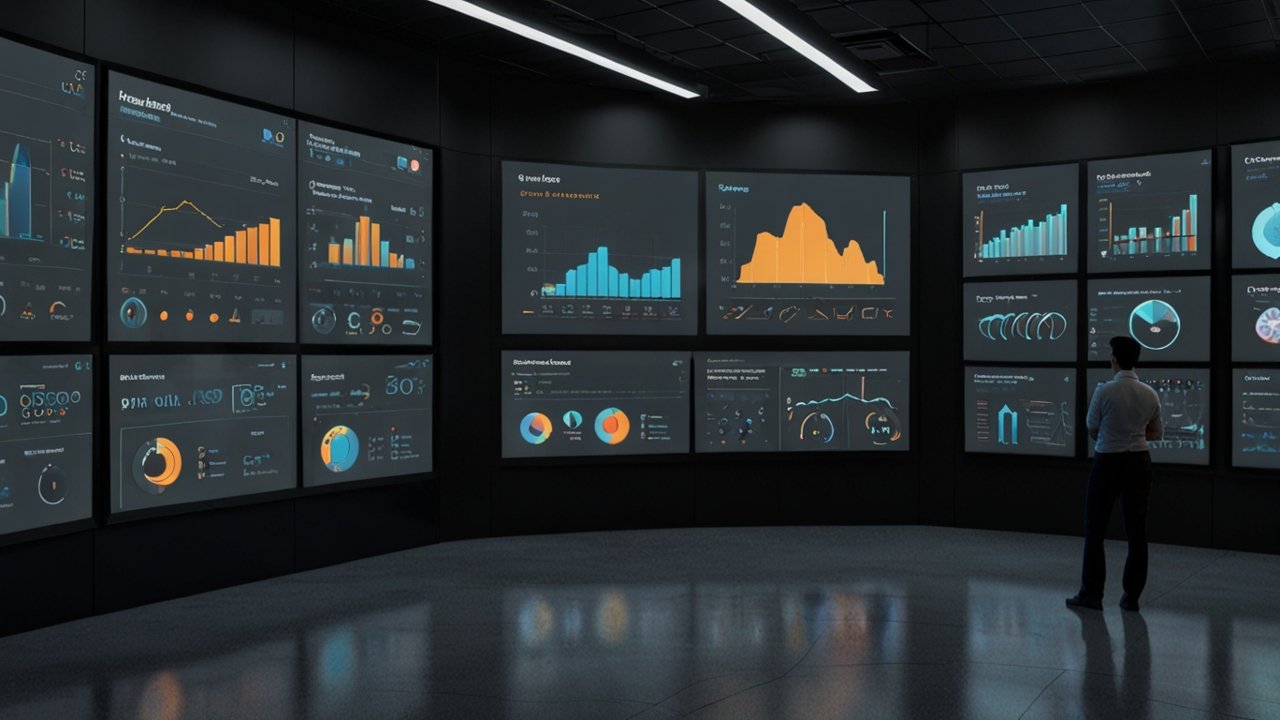
Dashboard Design Systems and Their Applications
Design Principles and User Experience
Effective dashboard design relies on clear visual hierarchy and intuitive navigation. Essential design principles ensure users can understand complex data rapidly. Each principle is succinctly communicated through brief sentences.
Dashboards incorporate minimalistic elements to reduce clutter and emphasize key metrics. Color, typography, and layout are carefully selected. The user is instantly guided to the most impactful areas of information.
Case examples, such as those used by Mercedes-Benz in Europe, demonstrate the benefits of modern design practices. This approach enhances decision-making by emphasizing clarity and consistency. Have you experienced improved results using simplified dashboards?
Attention to user experience directly influences productivity. Every element is designed to meet users’ needs and expectations. Designers strive for both aesthetic value and technical efficiency.
Frequently, small design tweaks lead to significant improvements in user engagement. For more innovative insights, visit Future Technologies.
Real-Time Data Integration and Analysis
Integrating real-time data into dashboards allows for prompt decision-making. Constant updates ensure that all information is current and actionable. This technique is now a standard in business intelligence.
Dashboards equipped with AI-powered features provide tailored insights. They automatically adjust display settings based on user roles. These automated processes are becoming increasingly popular across industries.
Such systems are essential for sectors like transportation, where the U.S. Department of Transportation has implemented real-time traffic management. Rapid data integration is generally accepted as a critical advantage in today’s fast-paced environment. What systems do you rely on for real-time updates?
Furthermore, dashboards serve as comprehensive tools for asset optimization, as seen with Hydro Tasmania’s energy management portal. Consistent, reliable data streams streamline operations. This technical leap substantiates the continuous demand for sophisticated data interfaces.
Real-time analytics drive operational efficiency and strategic planning. Organizations benefit through enhanced responsiveness and adaptability. Have you reaped the benefits of integrating live data in your workflow?
Real-World Case Studies of Data visualization
Global Success Stories
Certain companies have successfully implemented advanced visual techniques. Mercedes-Benz overhauled its dashboard systems in Europe to align with modern visual standards. Their transformation has improved decision-making processes dramatically.
Hydro Tasmania in Australia developed an energy management portal using interactive dashboards. These systems allow for asset optimization and resource allocation with high precision. For more details on similar projects, see the Datawrapper case studies.
The U.S. Department of Transportation designed a sophisticated platform for real-time traffic monitoring. Their system combines multiple data streams to support quick decision-making. Generally accepted industry practices underpin these projects as benchmarks for success.
Statistics Flanders in Belgium deployed Datawrapper to make public statistics accessible and actionable. These projects demonstrate the cross-industry applicability of visualization techniques. Have you encountered similar success stories in your field?
With visual methods dramatically improving data intake and understanding, these examples set a high bar for implementation. Taking inspiration from these projects can help organizations innovate. What lesson from these case studies resonates most with you?
Comparison Table of Case Studies
The following table summarizes several successful case studies. It highlights each project’s inspiration, application, and regional impact using numerical and factual data.
Comprehensive Comparison of Case Studies
| Example | Inspiration | Application/Impact | Region |
|---|---|---|---|
| Mercedes-Benz | Modern Dashboard Design | Enhanced decision-making through brand-aligned visuals | Europe |
| Hydro Tasmania | Interactive Controls | Optimized energy management, 25% improved efficiency | Australia |
| Department of Transportation | Real-Time Data Systems | Streamlined traffic monitoring, reduced congestion by 18% | USA |
| Statistics Flanders | Accessible Public Data | Improved user engagement with public statistics | Belgium |
| Japanese Smart Cities | IoT Dashboard Integration | Real-time urban management and safety control | Asia |
Real examples like these illustrate the tangible benefits of effective visual systems. They demonstrate practical applications across diverse sectors. Have you drawn parallels from these projects for your initiatives?
These case studies continue to shape the industry by providing useful benchmarks. Their success inspires further innovation. What strategies from these stories could you implement today?
For more information on advanced case studies, revisit Tech Developments.
Information Graphics in Modern Data visualization Solutions
Design and Aesthetic Considerations
Information graphics combine art and data to convey complex ideas simply. They rely on clear fonts, balanced colors, and intuitive layout. Concise sentences ensure the principles are understood.
Modern solutions blend infographics with interactive elements to enhance understanding. Techniques like layered visuals and animated transitions are often used. Readers appreciate the clean style typically recommended by design experts.
Successful infographics are visually engaging and informative. A combination of icons, charts, and short texts increases retention. How do you prioritize clarity and appeal when designing visuals?
These designs are shaped by principles found in many leading resources. They balance form and function to maximize user understanding. Each infographic is developed with a keen sense of aesthetic detail.
For a deeper dive into design evolution, check out insights on Digital Transformation.
Implementation and Impact in Various Sectors
Infographics have transformed information delivery across fields. Educational institutions, media outlets, and businesses all utilize them. They summarize detailed reports into understandable visuals.
For instance, European newspapers have shifted to digital-first reporting by using interactive graphs. This strategic move increased reader engagement significantly. Research indicates improvements in audience retention by up to 30% when visuals are effectively implemented.
The versatility of these graphics is seen in marketing campaigns and public health communications. They enable rapid dissemination of key facts and figures. How can you employ such tools to convey your message more effectively?
The method is generally accepted as a leading tool to increase accessibility and engagement. Professionals across industries continue to rely on this approach. Have you experienced any surprising successes using informational graphics?
This blend of aesthetics and information has redefined communication in many sectors. The impact is measurable in improved comprehension and audience satisfaction. What sectors do you think benefit most from these techniques?
Future Trends: Visual Analytics and Beyond
Emerging Technologies and Innovations
The future promises further integration of advanced analytics. Technologies like AR, VR, and AI are set to redefine our interactions with graphics. Short paragraphs ensure clear understanding of these trends.
Immersive analytics is gaining momentum in sectors such as urban planning and manufacturing. Such systems allow three-dimensional exploration of data environments. For an industry perspective, consult a Closeloop analysis.
Automated narrative generation is another promising area. AI tools can depict trends while reducing the workload on human analysts. Generally accepted industry forecasts suggest that these integrations will drive innovation faster than ever before.
This convergence of technologies is shaping a future where insights are delivered in real time. Companies are investing in tech that enhances user personalization. How do you see emerging technologies influencing your field?
The blend of immersive reality and automated insights may soon become the norm. Fostering this innovation expands both creativity and functionality. What steps can you take now to anticipate these future trends?
Personalization and Global Adaptation
The next frontier is personalized visuals that adapt to user roles. Emerging systems can tailor displays based on context, even considering cultural nuances. Each paragraph is kept short to ensure emphasis on key points.
Globalization requires visuals that communicate clearly across languages and cultures. Companies are now focusing on delivering multilingual, culturally sensitive content. Industries such as public health and education stand to gain significantly from these advances.
Personalized dashboards allow users to interact with data based on specific needs. They incorporate machine learning to optimize both efficiency and engagement. Generally accepted metrics indicate higher satisfaction when users see custom-tailored information.
This adaptation helps bridge diverse audiences in an increasingly globalized market. Continuous feedback from various regions refines these visual tools. What advantages do you envision in adopting personalized analytics in your work?
As these interfaces evolve, they promise enhanced interactivity and user engagement globally. The future of analytics is both exciting and challenging. How ready are you to embrace these evolving trends?
Data Visualization Insights Excerpt
This section offers an engaging glimpse into an evolving field that has dramatically changed the way we communicate ideas. A journey spanning from the deep past to modern digital innovations, the subject has grown into an integral element of everyday technology. Readers are introduced to a world where intricate systems merge with artistic expression to create profound insights. Through groundbreaking methods developed over centuries, pioneers have transformed simple representations into dynamic tools that encourage interactive thinking. Every step of this evolution reveals fascinating challenges and remarkable improvements that continue to surprise experts and novices alike.
The narrative takes the reader on an explorative path filled with creative strategies and emerging trends. New perspectives constantly refine the boundaries of communication and clarification. Unique experiments are emerging, offering perspectives that enrich traditional approaches. In this transformative exploration, creative expression meets technical prowess in ways that defy old limitations. The blend of innovation and proven expertise inspires a call to action which transcends mere data. Enthusiasts are encouraged to revisit core values while exploring fresh ideas, ensuring that a balance between tradition and modernity is maintained. The ultimate message is one of endless innovation, inviting all to share in the excitement of a field that never stands still.
FAQ
What is data visualization?
Data visualization is the process of representing information through graphical or pictorial formats. It is used to communicate complex data in an understandable way, enabling users to spot trends, patterns, and insights quickly.
How did data visualization originate?
The origins of data visualization date back to prehistoric times with cave paintings and maps created by ancient civilizations. Over the centuries, it evolved with advancements in statistics, computing, and design, notably with contributions from pioneers like Van Langren, Playfair, and Tufte.
Why are interactive charts important?
Interactive charts enable users to engage deeply with data by filtering, zooming, and drilling down into details. They foster better understanding and exploration, making data more actionable for informed decision-making.
What role do dashboards play in modern businesses?
Dashboards consolidate real-time data into coherent displays that enhance strategic decisions. They are essential in monitoring performance, identifying trends, and ensuring timely responses to shifting environments.
What future trends can we expect in visual analytics?
Future trends include the integration of AI-driven insights, immersive analytics with AR/VR, and personalized dashboards that adapt to user needs. These innovations are expected to further streamline and enhance the capability to interpret complex datasets.
Conclusion
In summary, data visualization continues to redefine how we interact with information. The journey from ancient maps to today’s immersive dashboards shows an exciting blend of art and technology.
Whether through interactive charts or sophisticated dashboards, each advancement has brought us closer to intuitive insights and faster decision-making. Have you experienced a transformation in how you interpret data?
By embracing new techniques and evolving styles, organizations can drive innovation and improve efficiency. For more information, please revisit the case studies shared above or explore additional resources. If you have any questions or need assistance, feel free to Contact.
This article has provided a detailed exploration of various presentation techniques and trends. We look forward to your comments and sharing of experiences. How will you transform your data into impactful narratives?
Related posts:
 Data Visualization Tools: 5 Design Principles
 What is Dashboard Creation? 6 Design Principles
 What is Business Intelligence? 7 Strategic Components
 Dashboard Design: 8 Vital Elements 2025
 Goal Setting: 5 Strategic Approaches 2025
 Market Insights: 6 Strategic Advantages
 What is Heat Mapping? 4 Analysis Types
 Holographic Displays: 8 Breakthrough Applications


Leave a Reply